Consent Management: Customizing Appearance with CSS
In this tutorial, we'll review how you can customize the appearance of Fides consent management using CSS.
After reading this, you'll be familiar with how to add CSS to your website and configure the various styles needed to customize the appearance of the consent experience for your visitors.
Prerequisites
For this tutorial, you'll need:
- A Fides Cloud or Fides Enterprise account
- The role of
OwnerorContributorfor your Fides organization. - At least one system with a data use on your data map. Read how to add systems to the Data Map now.
- At least one privacy notice configured. Read how to configure privacy notices now.
- Appropriate access to add or modify CSS on your website.
Styling Consent in Fides
You can fully customize your visitors consent experience with Fides. To do this, you can upload a CSS stylesheet using our Consent Experiences UI.
Adding CSS to your website
Fides relies on a set of predefined CSS values to style the consent experience. To download a stylesheet template to use for a starting point, please click here (opens in a new tab) or copy below.
To upload the stylesheet, please follow these steps:
- Navigate to Consent in the navigation.
- Click on Experiences in the lefthand menu.
- Click on the Upload stylesheet button.
- Click in the pane to upload the stylesheet and select the appropriate file.
- Click Submit.
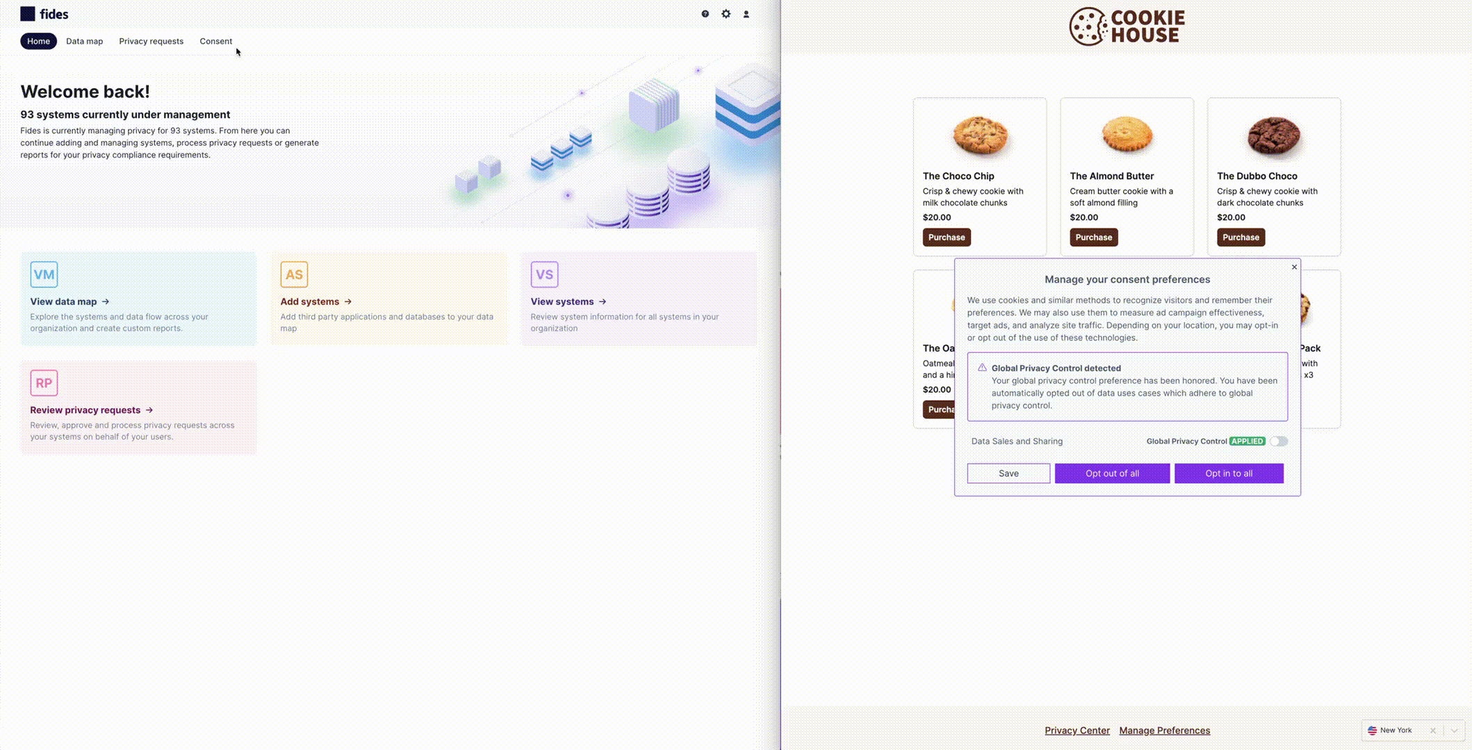
Example: Interactive CSS Codepen
You can preview and adjust your CSS using this interactive codepen (opens in a new tab).
Fides CSS Stylesheet
Fides ships with an existing set of predefined stylesheet values to simplify customization, which you can view below:
/**
* Fides Banner CSS styles
*/
:root {

  /* Base Colors */
  /* Base Color: Primary color that sets default component and button color */
  --fides-overlay-primary-color: #8243f2;
  /* Base Color: Color for backgrounds of notices and components */
  --fides-overlay-background-color: #f7fafc;
  --fides-overlay-background-dark-color: #e2e8f0;
  /* Base Color: Body font color */
  --fides-overlay-font-color: #4a5568;
  /* Base Color: Link font color */
  --fides-overlay-font-color-dark: #2d3748;
  /* Base Color: Hover color for pop-up */
  --fides-overlay-hover-color: #edf2f7;

/* Base Fonts */
  /* Base Font: default font set across components, text and buttons */
  --fides-overlay-font-family: Inter, sans-serif;
  /* Base Font: font size for small text */
  --fides-overlay-font-size-body-small: 0.875em;
  /* Base Font: font size for all text */
  --fides-overlay-font-size-body: 0.95em;
  /* Base Font: font size for title text */
  --fides-overlay-font-size-title: 1.2em;
  /* Base Font: font size for button text */
  --fides-overlay-font-size-buttons: 1.05em;


/* Buttons */
  /* Button: Primary button color */
  --fides-overlay-primary-button-background-color: var(
    --fides-overlay-primary-color
  );
  /* Button: Primary button hover color */
  --fides-overlay-primary-button-background-hover-color: #9569f4;
  /* Button: Primary button text color */
  --fides-overlay-primary-button-text-color: #ffffff;
  /* Button: Primary button border color */
  --fides-overlay-primary-button-border-color: transparent;
  /* Button: Secondary button background color */
  --fides-overlay-secondary-button-background-color: var(
    --fides-overlay-background-color
  );
  /* Button: Secondary button hover color */
  --fides-overlay-secondary-button-background-hover-color: var(
    --fides-overlay-hover-color
  );
  /* Button: Secondary button text color */
  --fides-overlay-secondary-button-text-color: #2d3748;
  /* Button: Secondary button border color */
  --fides-overlay-secondary-button-border-color: var(
    --fides-overlay-primary-color
  );


  /* Text */
  /* Title text: Font color */
  --fides-overlay-title-font-color: var(--fides-overlay-font-color);
  /* Body text: Font color */
  --fides-overlay-body-font-color: var(--fides-overlay-font-color);
  /* Link text: Font color */
  --fides-overlay-link-font-color: var(--fides-overlay-font-color-dark);


  /* Toggles */
  /* Toggle: Active color for enabled toggle in 'on' position */
  --fides-overlay-primary-active-color: var(--fides-overlay-primary-color);
  /* Toggle: Disabled color for toggle that is disabled in 'on' position */
  --fides-overlay-primary-active-disabled-color: #bda4f7;
  /* Toggle: Inactive color for toggle in 'off' position */
  --fides-overlay-inactive-color: #cbd5e0;
  /* Toggle: Disabled color for toggle in 'off' position */
  --fides-overlay-disabled-color: #e1e7ee;


  /* Dividers */
  /* Divider: Divider color between each privacy notice in pop-up */
  --fides-overlay-row-divider-color: #e2e8f0;
  /* Divider: Hover state of divider color between each privacy notice in pop-up */
  --fides-overlay-row-hover-color: var(--fides-overlay-hover-color);

  /* Badge */
  --fides-overlay-badge-background-color: #718096;

  /* Select */
  --fides-overlay-select-border-color: #e2e8f0;

/* Padding & Radius */
  /* Padding: Padding space of banner and pop-up components */
  --fides-overlay-padding: 1.5em;
  /* Padding: Padding space for buttons */
  --fides-overlay-button-padding: 0.5em 1em;
  /* Radius: Corner radius of banner and pop-up components */
  --fides-overlay-component-border-radius: 4px;
 /* Position: Position of banner component when initially loaded */
  --fides-overlay-banner-offset: 48px;

/* GPC specific settings */
  /* GPC: Background color when GPC is applied */
  --fides-overlay-gpc-applied-background-color: #38a169;
  /* GPC: Text color when GPC is applied */
  --fides-overlay-gpc-applied-text-color: white;
  /* GPC: Background color when GPC is overridden */
  --fides-overlay-gpc-overridden-background-color: #e53e3e;
  /* GPC: Text color when GPC is overridden */
  --fides-overlay-gpc-overridden-text-color: white;
}